Build linear equations from a scatter plot in LibreOffice
Probably most of us have used software to store data in a spreadsheet and visualize this data. However, these tools can offer much more than that! Recently, I learned that LibreOffice can find out a mathematical function which can be used to predict future values. For instance, based on historical data, we can try to forecast the growth of the average salary over time. Naturally, the accuracy of this method is not guaranteed, but that is not the point of this tutorial.
Data
We need some data to build a chart. I am going to use the amount of points that two Formula 1 drivers had after each of the last five races. I want to see if Lando Norris can catch up with the championship leader Max Verstappen by the end of the season.
The last five races are:
- British Grand Prix
- Hungarian Grand Prix
- Belgium Grand Prix
- Dutch Grand Prix
- Italian Grand Prix
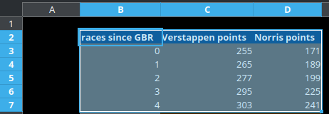
Let us put how many points each driver had after these races.
Since we cannot use race names in mathematical equations, for the x-axis I will use the number of races since the British Grand Prix, allowing us to have a clear representation of points growth since the first race in the series.
Chart
Now we can select the cells containing this data:
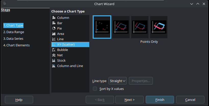
Next, go to Insert -> Chart in the main menu. Pick the XY (Scatter) type and click the Finish button.
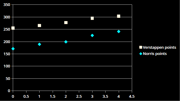
The scatter plot is ready!
LibreOffice can generate a linear equation for us based on this data. It will not be fully accurate since the actual growth is not linear, but it will be as close to all data points as possible. That is close enough for our purpose.
Double-click on the chart to enter edit mode. Then, right-click on one of the dots on the plot. That should bring the following menu:
We want to see the equation, so select "Show Equation", and then click OK. Repeat that for both Verstappen's and Norris's data points.
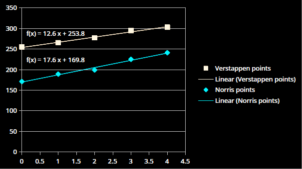
For each driver, this should produce:
- A line depicting the points growth with each race.
- A function we can use to forecast how many points the drivers will have in the future.
Forecast
Can Lando Norris overtake Max Verstappen in the championship with eight races left until the end of the season? Let us find out!
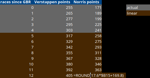
We can use f(x) = 12.6x+253.8 to calculate Max's points after x races, and f(x) = 17.6x+169.8 to calculate Lando's points. By substituting x with a value from the B column (races since the British Grand Prix), LibreOffice can automatically perform the calculations for us. Just enter the formula and drag it down. I round the final result because drivers cannot have 346.789782134 points.
It turns out that if the current trend continues, Max Verstappen will comfortably win the title with one race to go! A driver can earn a maximum of 26 points per race. While I would not bet all my savings on this outcome, it clearly shows that Lando Norris and his team must be at the top of their game to have even a slight chance of beating the incumbent champion.
I'm not a data analyst or anything like that, so it is up to you how to use this feature and how to interpret the results. I just thought it would be good to share this knowledge!
